Saturday, 15 December 2012
Photoshop Edits
These are the images used in my magazine shown as before and after shots. The 'after' shots appear after vigorous editing in order to make them fit the theme and general style of my publication. I edited them using photoshop because I felt that it would allow them to possess a more sophisticated and professional feel about them, all of which would hint at the possibility of my magazine 'Vinyl' fitting in really well into the industry as a whole.
Friday, 14 December 2012
Starting Construction ( Double Page Spread)
Luckily, as I created my front cover and contents page before the double page spread, that meant that I could launch myself straight in to construction as I already had a general theme set in the back of my mind. I wanted to keep the colour palette simple again with the added attention grabbing aspect of a few areas of brighter colour (red). Saying this, I did still encounter problems and slight flaws in my mental designs. I had problems with the text because although I felt that it looked effective with varying opacity, stretching over the main image of yasmin glass, there was the practical aspect of some people therefore struggling to read the interview in places. This would obviously minimise my audience significantly to those with good eyesight, and so to avoid this issue, started to experiment with 'wrapping' the text around the images and altering the positioning of the images..
As you will be able to see in this photo peach, I finally address the problem of the text possibly being unreadable to some people by 'wrapping' it (as I mentioned) around the main image. Also, after obtaining many opinions from potential readers and friends, I decided to effectively switch the whole orientation of my double page layout. I did this because of the fact that we read from left to right, so my proposed layout means that hopefully the audience would first rest eyes on the 3 'snapshots' of Yasmin on the left, so they learn a little bit about her personality. Next, obviously they would continue to read the interview before finally allowing their eyes to end up resting on the main, larger image of Yasmin, as I felt that, that particular image of her sums up her created personality as a whole and would possibly leave readers wanting to know more about her and her music, creating mystery surrounding her.
Construction Of Contents Page
My contents page was also hard to select a theme for it to represent. My creation techniques were short but drastic and soon reflected ideas from my preliminary task with the added feelings of a slightly muted colour palette and simple images. I started off the design process by looking into yet another futuristic code and convention as featured by music magazines such as 'Q'. At first, I wanted my contents page to be so simple and clear for the readers and act as a practicality aspect to guide my audience through my magazine effortlessly. However, when I started to look back at my research of real life contents pages, I realised that a contents page can convey a lot about a magazine because it sums up everything that is featured in that particular edition. So, a simplistic theme may be effective, but if it's so simplistic that it's verging on becoming boring, then it will not entice readers in the slightest. So, I developed my idea drastically in one huge step..
I suddenly had so much inspiration from looking over the detailed research I did into the layout of contents pages for my planning. So, I combined the inspiration with ideas stemming from the 'scrapbook style' that I've mentioned before, until I reached my final product. I decided to include a section called 'Note from the editor' as this is an old technique put in place by most magazines in order to make the audience feel so involved and personally directed by the words of the editor, as if He/She was talking to each reader individually. This technique draws the audience in and totally engages them in the articles etc mentioned on your contents page.
Construction Of Cover Page
This video demonstrates the very first stages of the construction of my front cover. It shows how I started off with a completely different modernised and slightly futuristic theme. I soon realised that this theme was not going to work for my particular style of genre that I was aiming for and this lead me to develop my ideas further using different codes and conventions..
I then experimented with the idea of matching the skin tone of my cover star Yasmin to the colour palette and general theme of the magazine. I did this because I researched into special editions of NME when they completely adapt and evolve their style, including their colour scheme for a 'one-off' edition in order to honour the featured artist. An example of this is when I looked at the special edition which featured John Lennon. However, once I could visually picture the warm toned colours all together on one cover, I felt that it sent out too much of an almost naturalistic theme because of the various skin tones etc. I then started to experiment further with fonts (as you see at the end of this photo peach) and
colours yet again to adapt this idea into my next theme that I created..
I finally decided on a more simplistic and sophisticated colour scheme as well as using editing software to tone down the images in terms of contrast and again, colour. As you will see in the photopeach video, I found it extremely different to decide whether or not to feature additional photographs on my cover. At one point, I had two extra pictures featured alongside Yasmin's headshot. Although I felt that they really mirrored the conventions of most fashion and music magazines really well, in the end, I decided to get rid of them as they were detracting vital attention away from my cover star. I constantly kept being drawn back to the NME John Lennon inspiration and decided that I should make this edition of 'Vinyl' a supposed tribute to 'Yasmin Glass' and her musical career. I therefore kept other images out of the picture and allowed my colour scheme to compliment Yasmin's personality and music genre. I even matched some of the colours of fonts to elements such as her lips and her hair.
Monday, 26 November 2012
Shoots of my Coverstar
At first, I was pretty happy with the way that my first photoshoot turned out. I loved the simple colours that I used and the interesting angles and compositions. These images were absolutely perfect for my double page spread, however problems started to arise when I allocated on of the images for my cover. Once I saw the image as a part of my front cover, I soon realised that they weren't as effective as a 'front of house' message that shows exactly what my magazine is all about. This was for a few reasons, one of them being that the use of a prop (the guitar) was distracting vital attention away from her and allowing her to seemingly blend in to the background. One other factor that encouraged me to re-shoot was the way in which her white blouse did not contrast with the white background at all. For this reason in my next shoot, I chose black clothing so that it powerfully contrasted against the pure white background.
I was much happier with my results from my re-shoot. This definitely allowed me to expand my ideas further and obtain images that would be much more striking on the cover of my magazine.
Wednesday, 14 November 2012
Tuesday, 13 November 2012
Mock plans & layout for music magazine
From completing a mock up plan of my front cover, contents page and double page spread I have learnt about the basic ideas and themes that I want my music magazine to incorporate and display. This will allow me to have a starting point that is easy to pick up from when I actually start to make my magazine and will therefore allow me to get straight into becoming creative with my ideas as the bases for the planning stages will be complete.
Saturday, 10 November 2012
Rate card for my magazine
Vinyl rate card
I have learnt that my magazine needs to appeal to a particular audience that would be interested in the topics that I have stated in my rate card. Also, by gathering together all of the information surrounding similar magazines such as 'NME' and 'Clash' I now have a strong idea of what my ideal target audience would want and look for in my music magazine.
I have learnt that my magazine needs to appeal to a particular audience that would be interested in the topics that I have stated in my rate card. Also, by gathering together all of the information surrounding similar magazines such as 'NME' and 'Clash' I now have a strong idea of what my ideal target audience would want and look for in my music magazine.
2nd Draft Of Double Page Spread
The corrections I have done for my 1st draft of the double page spread interview have been shown in a bold, pink text so that I can clearly see what was altered.
Yasmin Glass is one of the biggest rising indie signing stars of the moment. She has been working her way to the top by playing gigs all over Europe for the last 2 years and has finally hit the big time, she is due to release her album ‘gypsy eyes’ in just two weeks time on November 18th. Not only is she making herself an impressive name in the music industry but she seems to be causing a storm on the fashion front too. Her signature red lipstick and tousled ‘sex hair’ (as her fans refer to it) have seen the likes of Marc Jacobs and Vivienne Westwood literally fighting over who’s brand she chooses to represent. There’s one thing for sure, this girl is not to be messed with.
So, Yasmin you had your biggest gig to date last night, supporting The Smiths! How did it go?
It was so,so amazing! I got to perform alongside The Smiths, People would kill for that opportunity, I literally am the luckiest girl ever, like it’s only just sunk in..The SMITHS!
Congrats! How have you been coping with your rise to fame? Any tips?
Uhh fame, I hate that term! It’s very nice of you to say so but I really don’t see it personally, I’m just happy doing what I’m doing. Some of us just get lucky! I’m never gonna be one of those mega bitch super stars who demand skinny no fat soy lattes with a sprinkling of anorexia and treat people like they’re dirt. That’s really not who I am at all.
Marc Jacobs and Vivienne Westwood seem to think you’re the hottest thing right now..
Oh god, you’ve made me blush now. I am so psyched that they love my style and I couldn’t wish for more than to make it in the music industry and the fashion world! Double whammy!
You have been nominated for one of Vogue’s fashion icon of the year awards, why don’t you talk us through your outfit today?
I still can’t believe I have even had the chance of being nominated! I spent my teenage years reading Vogue, wishing that one day I could appear on their pages alongside some of the most iconic people in the world. Cheesy right?! Anyway yea of course, I kind of just wanted to have a classic vibe today. My shirt is American Apparel, umm plain Topshop leggings, some Chelsea boots I picked up as a total bargain in a Camden Market and of course my red Chanel lipstick. I never ever leave the house without it.
Your classic style compliments the theme of your new album, Gypsy Eyes. How would you describe your inspirations and what message did you want to get across?
Haha, I’m guessing that’s a nice way of asking me what on earth made me think of my album title? Well.. the answer is, even I’m not too sure! um I wanted something that sounded interesting, intriguing and something that hadn’t been done before. Eyes have always seemed mysterious to me and they can tell a lot about a person.
What about your genre of music?
If I really had to put it down to one genre, then it would have to be indie/alternative with a bit of electronic eclectic vibes thrown in but I can’t tell you how much I hate labels! For me, the moment society brands a musician as one predictable stereotypical genre, that’s where the magic of making music ends. It’s never good for musicians to go down that route of being labelled. They should be whoever they want to be.
Do you have any music artists that have influenced you?
I could sit here and come out with the general rubbish people do such as Pink Floyd and the Rolling Stones when really, they know nothing about their music at all. However, my inspirations are so diverse it’s crazy! David Bowie, M.I.A, Marina & the Diamonds, Sky Ferreira and MGMT just to name a few. I swear the list is constantly being added to, the amount of music icons out there is amazing when you think about it.
Where would you like to see yourself in 2 years time?
Professionally, I would love for things to continue in the amazing way that they are, seeing my career unfold before my eyes would be pretty awesome. In my personal life, I’m forever dreaming of waking up in an attic apartment with a cigarette and coffee, watching morning Brooklyn. I guess then I would be happy that my life is complete.
By having my first draft evaluated and then edited helped me to learn that even the smallest detail such as whether you have used a capital letter or paid attention to your punctuation massively affects your article. A real music magazine would never have any spelling or grammar mistakes because it would downgrade the look of the magazine and would mean that it's not professional. For these reasons, I have learnt to pay more attention to the smaller details and basic foundations of my article because if I do include an error in my magazine, then the idea of it looking professional and up to standard would be unattainable.
By having my first draft evaluated and then edited helped me to learn that even the smallest detail such as whether you have used a capital letter or paid attention to your punctuation massively affects your article. A real music magazine would never have any spelling or grammar mistakes because it would downgrade the look of the magazine and would mean that it's not professional. For these reasons, I have learnt to pay more attention to the smaller details and basic foundations of my article because if I do include an error in my magazine, then the idea of it looking professional and up to standard would be unattainable.
Tuesday, 6 November 2012
Outfit and look plans
1st Shoot: My first shoot will feature my cover star and will be used to obtain a final image for my front cover. The images will also feature throughout the double page interview.
2nd Shoot: My second shoot will still feature my cover star although she will be dressed in a contrasting outfit to portray aspects of her personality. These images will also be featured in the double page interview aswell as on the contents page.
3rd Shoot: My third shoot will be of a group of my friends that will be playing the part of an indie/alternative band and these images will feature on the contents page.
4th Shoot: My fourth and final shoot will be of my brother who will be playing the part of an indie singer and these photographs will also feature on the contents page.
Another aspect that my magazine could include is the idea of having a 'fashion box out' which would include a few extra photos situated in the box to the side of the second page. These images would also have the outfits and style of the artist as a main focal point as this would help me to achieve the ideal fashion/music genre.
I have learnt that by planning out each stage of what you would ideally want your cover star and featured artists to look like, you can then create a true idea of how you your artists will be presented and you can then see how you need to alter your ideas to allow them to fit into the style and theme of your magazine.
My own flat plan

Photo shoot planning


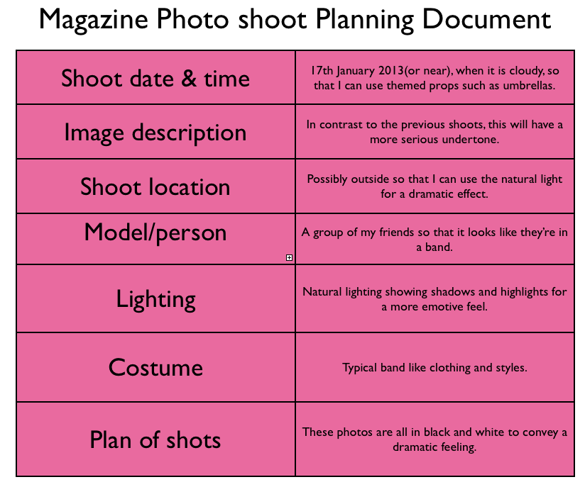

From this task, I learnt how I can organise shoots that each have original styling and various ideas so that they are not all the same. This allowed me to come up with ideas so that the magazine can flow.
Monday, 5 November 2012
1st Draft Of Double Page Spread
Yasmin Glass is one of the biggest rising indie signing stars of the moment. She has been working her way to the top by playing gigs all over Europe for the last 2 years and has finally hit the big time, due to release her album ‘gypsy eyes’ in just two weeks time on November 18th. Not only is she making herself an impressive name in the music industry but she seems to be causing a storm on the fashion front too. Her signature red lipstick and tousled ‘sex hair’ (as her fans refer to it) have seen the likes of Marc Jacobs and Vivienne Westwood literally fighting over who’s brand she chooses to represent. There’s one thing for sure, this girl is not to be messed with.
So, Yasmin you had your biggest gig to date last night, supporting The Smiths! How did it go?
It was so,so amazing! I got to perform alongside the smiths, people would kill for that opportunity, I literally am the luckiest girl ever, like it’s only just sunk in..the SMITHS!
Congrats! How have you been coping with your rise to fame? Any tips?
Uhh fame, I hate that term! It’s very nice of you to say so but I really don’t see it personally, I’m just happy doing what I’m doing. Some of us just get lucky! I’m never gonna be one of those mega bitch super stars who demand skinny no fat soy lattes with a sprinkling of anorexia and treat people like they’re dirt. That’s really not who I am at all.
Marc Jacobs and Vivienne Westwood seem to think you’re the hottest thing right now..
Oh god, you’ve made me blush now. I am so psyched that they love my style and I couldn’t wish for more than to make it in the music industry and the fashion world! Double whammy!
You have been nominated for one of Vogue’s fashion icon of the year awards, why don’t you talk us through your outfit today?
I still can’t believe I have even had the chance of being nominated! I spent my teenage years reading vogue, wishing that one day I could appear on their pages alongside some of the most iconic people in the world. Cheesy right?! Anyway yea of course, I kind of just wanted to have a classic vibe today. My shirt is american apparel, umm plain topshop leggings, some chelsea boots I picked up as a total bargain in a camden market and of course my red chanel lipstick. I never ever leave the house without it.
Your classic style compliments the theme of your new album, gypsy eyes. How would you describe your inspirations and what message did you want to get across?
haha, I’m guessing that’s a nice way of asking me what on earth made me think of my album title? Well.. the answer is, even I’m not too sure! um I wanted something that sounded interesting, intriguing and something that hadn’t been done before. Eyes have always seemed mysterious to me and they can tell a lot about a person..
What about your genre of music?
If I really had to put it down to one genre, then it would have to be indie/alternative with a bit of electronic eclectic vibes thrown in but I can’t tell you how much I hate labels! For me, the moment society brands a musician as one predictable stereotypical genre, that’s where the magic of making music ends. It’s never good for musicians to go down that route of being labelled. They should be whoever they want to be.
Do you have any music artists that have influenced you?
I could sit here and come out with the general rubbish people do such as pink floyd and the rolling stones when really, they know nothing about their music at all. However, my inspirations are so diverse it’s crazy! David Bowie, M.I.A, Marina & the diamonds, Sky Ferreira and MGMT just to name a few.. I swear the list is constantly being added to, the amount of music icons out there is amazing when you think about it.
Where would you like to see yourself in 2 years time?
Professionally, I would love for things to continue in the amazing way that they are, seeing my career unfold before my eyes would be pretty awesome. In my personal life, I’m forever dreaming of waking up in an attic apartment with a cigarette and coffee, watching morning Brooklyn. I guess then I would be happy that my life is complete.
Saturday, 3 November 2012
Typography
From this activity, I have learnt that the way in which your typography is presented throughout your whole magazine is vital in the way that you want your publication to be perceived. Choosing the right text for your genre and theme can be the difference between creating a successful, professional looking magazine and a magazine that just doesn't flow. For this reason, I have spent a lot of time researching into different texts, fonts, colours, sizes etc to make sure that my text really does fit in with my magazine.
Saturday, 20 October 2012
Flat plan
My flat plan is based on the October 2012 issue of "Clash' magazine, here is an image of the front cover:

From this, I have learnt that it is possible to create a successful and effective music/fashion magazine because there is space in the market for this idea as it's quite a new concept and could be viewed as being different which would persuade people to buy into this new concept. I have decided from this that I will make a music and fashion magazine combined together because it's also of more interest to me and therefore I feel that I could use more passion and determination to compose a magazine and fulfill the task to my full potential.
Thursday, 18 October 2012
Video of 'Dragon's Den Task' and review of mood board
Notes on the dragon's den presentation.
1) How did you come up with this idea? (use your research to help you)
* I came up with my idea for my magazine through the many different methods of research I did into the music magazine industry.
* I looked into genres of music magazine that I personally like and took note of themes and codes and conventions that they were composed of.
* One good method of putting my ideas together was via my ‘surveymonkey’ because I got a thorough idea of what different people were looking for in my magazine.
* Although I knew early on that I wanted to make a magazine with an original/indie rock persuasion, I looked into many different genres anyway so that I could be influenced by aspects from each and therefore hopefully allow mine to reach out to multiple audiences and become accepted in the music industry as a whole.
2) Is there space in the market for this type of magazine?
* There are a few magazines in the industry that use the same theme and genre as my planned publication but I feel that there would be space for my personal magazine because although I will create an original/indie rock theme, I have taken inspiration from many different types of genre and will attempt to combine influences from each. This will hopefully create a different and effective style of magazine that will attract a lot of readers.
3) Who is going to be the target audience for your magazine?
* The desired target audience for my magazine is aimed mainly at a youthful, teenage audience. This is because I feel like the genre suits this audience the most.
* I also wanted to convey the idea of a ‘fresh’ and ‘trendy’ atmosphere and I felt that the best way to do this was through aiming my publication towards a youthful target group.
* Another factor was that wanted to use my age to my advantage because I personally know what this particular age group is interested in and what appeals to them. This benefits me because through the eyes of someone of the age group that I’m aiming to please, I can hopefully generate a magazine that totally appeals to my audience.
4) Be prepared to speak about an audience so make sure you know who they will be.
5) Have ideas of the double page spread, contents and front page stories.
* I am going to do a double page of a fictional, up-coming artist of an indie rock genre. It’s going to be composed of an interview with the artist themselves about a number of topics such as how they had their ‘rise to fame’ and who they are and what they’re about.
* I am going to take inspiration from magazines such as NME and Q and the relaxed style in which they are interviewed and presented.
Friday, 12 October 2012
Annotations of music magazines

My next task was to look at a real life example of a music magazine and dismantle essential parts of the publication in order to understand how all of the components work together. For this, I selected the latest issue of NME because I felt that it could be a prime role model and influence for my planned magazine and also, the fact that it's a brand new publication would suggest that it's very up to date according to what their target audience wants. This first photo shows my annotations about what I found effective and interesting on the cover page and contents page. My annotations, as you can see, go into a lot of detail about different codes and conventions.

This image shows the annotations of the contents page in more detail and the start of my annotations surrounding the double page interview with music legend John Lennon.

In this picture, you can see my extended notes and annotations into both sides of the interview. I focused on both pages separately because although they are presented together, they both contain varying factors that allow the two pages not to look the same and be about the same thing. So, they contain different components and compose varying mise-en-scenes yet they both work together as a diverse and varied article.

This is another head on shot of the interview which gives a brief idea of the amount of detail I went into my notes with.
From this exercise, I learnt that I am in fact strongly influenced by NMEs magazines as they embody the theme and styles that I would ideally like to incorporate into my magazine. This factor really helps me as it's almost like having an aspirational piece which I can try and replicate some aspects from. By writing notes alongside the cut outs and being able to pick apart essential elements from NME, it has aided me in seeing what really does make a magazine what it is and how it uses techniques such as persuasion to attract a larger area of audience.
Thursday, 11 October 2012
Thinking of a concept for my music magazine
From this task, I have learnt that the basic concepts on which your magazine is based is vital in appealing to your ideal target audience and the way that your music magazine is perceived in the public eye. It has also given me a clearer idea of the routes I would have to go down of selecting the right oligopoly (for example) that would best suit my magazine.
Wednesday, 10 October 2012
Contents Page Evaluation
From doing this activity using Glogster, I have learnt a lot about the what specific aspects make a contents page. I particularly focused on the layout of the composition so that I could become influenced and use different techniques to compose my own contents page. The idea behind this was finding the balance between having a very simple layout and allowing it to become overcrowded. Overcrowding the contents page with too much information could set up a very unprofessional and cheap feel. This is obviously not the direction in which I'd like to take my publication as I'm aiming for a more established and sophisticated audience.
Representation of music magazines

Costume - She is wearing a very seductive and typically sexy outfit which connotes mystery and therefore creates interest in her as an artist. It could also be a stereotypical reference to the genre of music that she is famous for. The costume a coverstar models is essential in setting the tone of the feature about them, so for my magazine, I will think carefully about the kind of tone I would ideally like to have.
Hair and makeup - Her hair is slightly windswept and tousled which adds interest to her personality and causes her photo to fit into the codes and conventions of the cover. As for her makeup, a base of darker colours have been used which again, hints towards the idea of her being percieved as a mysterious and intriguing figure.
Pose - her casual pose allows her to come accross as being playful and almost entices potential readers to purchase the magazine.
Facial Expression - She is looking directly into the camera lens with an intense facial expression and this engages the readers. I will use techniques like this in my magazine to make readers feel as involved as possible and engaged within the publication.
Framing - A medium long shot (MLS) shot is used to show a large proportion of her body, which shows more of her costume and her stance rather than just focusing on her face.
Font - The font is actually quite a standard almost plain style. Although it works for this particular cover because it results in the image becoming the main focal point of the whole cover.
Colours - The colour scheme is of a unisex orientation because of the use of typical ‘male’ colours such as blue becoming entwined with glamorous and typically more ‘female’ colours such as gold. I find that this is very effective as it expands the target audience even further.
REPRESENTATION OF THE MAGAZINE - The magazine represents a very modern and informal style of publication simply because of the way that all of the codes and conventions interact with eachother and allow the theme of the publication to flow and complete the desired style of having a magazine that appeals to younger people because of the trendiness aspect of it as a whole.


Hair - His hair represents the band’s personality and the style that they aim to create so the cover has a continuing theme and ties in with the genre of the arctic monkeys.
Thursday, 4 October 2012
Statistics from my 'surveymonkey'
Findings from my 'surveymonkey' on Prezi
As I said before, I found that the survey monkey was a very useful tool in teaching me how to appeal to my target audience and engage with them.
Wednesday, 3 October 2012
Focus Groups
For this task I asked 3 people from my own teenage age group their opinions on 3 different music magazine covers in order to see how different people respond to different genres and styles.

First up was 'Kerrang!' I asked my friend Grant questions such as 'does the cover appeal to you?', 'Is it effective and if so why is it effective?' and 'what aspects stand out for you personally?'
These are his answers: 'I love Kerrang! Well, his face stands out and so does the cover as a whole. The band's name is clearly visible and well placed. I also guess the rest of the text is pretty well placed since it's mostly the same font and stays away from blocking the view of the main feature.'

Next, I asked my friend Yasmin the same questions but referring to a totally different genre of music magazine.
Here are her answers: 'Evidently all of the standard techniques used by successful magazines are present in this example but by having the main cover star shown as a tall contrast against the cityscape and buildings show her rise to success as a powerful female artist!'

Lastly, I asked my friend Izzy the same questions yet again but on the topic of yet another different style of music magazine.
Here are her answers: 'I like the cover as the big image of the artists face engages with the reader by letting them know straight away the main focus of the magazine issue. The cover is effective as the image of the artist stands out which grabs the audiences attention, and the text also stands out with the use of bold colours such as blue and pink. I think that the magazine cover works as a whole as it is informative, and also very eye catching!'
I learnt how it's not just all of the features that are important (such as the title) but it's also about how they work together and if they compliment each other because if they didn't, the mise-en-scene would not work as a whole and would cause the cover to not be very successful.
Audience research-Rate cards

Before completing this task, I never knew that institutions knew so much about their audiences! I think that it's clever in the way that they have obviously put some research methods in place to find out these details but they have seemingly done this discreetly so that they don't draw readers attention to the adverts and not the content of the magazine. A successful magazine needs a sensible and relatable balance between content and adverts.The stats show that approximately 74% of all readers are male, so advertisement directed towards males would be very effective as it would attract a lot of attention but then again too much male orientated advertisements could possibly push female readers away. Therefore, I have learnt that the best option for NME would be to have a balanced gender advertisements because it would appeal to all readers that way.
Survey Monkey
From this I learnt that my original ideas of the potential audience I was aiming to appeal to were quite accurate. This shows that I am working in the right direction in order to target a youthful audience of a teenage origin. I could also use different techniques such as selecting adverts intentionally and thinking over my choices critically to ensure that I am attracting just the right desired audience and readers.
Tuesday, 2 October 2012
Recording An Audience
This interview that I did with two people of a similar age group to me really helped me to learn how to approach factors such as where I would hypothetically be 'selling' my magazine and how to brand it in order to convert it to the focal point of a magazine stand and to draw attention to it without it being viewed as 'over the top' or 'trying to hard'. I realised this when my interviewees mentioned that they would prefer a simpler main headline such as an interview with their favourite band as opposed to one that has only been written with the sole intention of drawing in an audience because that can also sometimes be viewed as being cheap and unprofessional.
Detailed look into music magazines in a shop
I learnt that the importance of the main features such as the title, fonts and codes & conventions on music magazines are obviously the main key in understanding how magazines become successful in the competitive media industry. The way in which they present themselves is essential if they want to secure a promising response. This shows that I have learnt that I shouldn't overlook seemingly small aspects such as use of fonts because they could be the deciding factor that people have when choosing a magazine.
Music magazines-How are they shown in a shop?

This task required me to go into a shop and photograph a stand which was displaying magazines, especially music magazines. Unfortunately there was a lack of music magazines in this particular shop apart from a few issues of 'Kerrang!' which is shown towards the left hand side of the image. I think that this could say even more about the audience for music magazines and the type of person who reads them. The shop I visited is not a usual place where many teenagers visit, so I feel that this outlines in even more detail how dependent the music magazine industry is dependent on young people to buy and read their publications.

Here is another photograph which shows the way in which the magazines are placed on the shelves and exactly where the section for music magazines has been situated.
From having the experience of actually going into a shop and discovering where the music magazines are presented in a certain situation, I have learnt that (in this particular example) that very few music magazines are displayed and that I would need to make my cover eye catching and attention drawing in order to make it stand out from the rest and really make an impression on people.
Considering that the first shop I visited had a very limited selection of music magazines, I felt that the research didn't really influence me or help at all when it came to using those influences in designing my magazine. Therefore, I decided to visit another shop and get a more of an idea of a broader selection of magazines with alternate genres.

This is just one example of a single section of a music magazine stand in a different shop. This shows how much variation the stock of magazines can have depending on where they are sold and the specific target audience that is predicted to enter the shop.

From this image, we can observe that the more mainstream magazines featuring upcoming artists are situated towards the middle of the stand, on the middle row and therefore leaves the end of the rows free for the less popular publications such as 'Guitar' which specifically focuses on one instrument as opposed to a generic music magazine.
Audience Research

Institutional Video
I found out that the main oligopolies (especially the main 3) in this specific industry actually produce many, many different genres of magzines which can range from a gardening publication to a magazine teaching people to play the piano. This way in which they work in very diverse topics shows their flexibility and how they really do know what they're doing. For my magazine, I would probably aim for using an institution such as Bauer Media because they are responsible for producing 'Kerrang!' and 'Q' and these are two of the main magazines that have influenced me strongly throughout my designing process. Therefore, I feel that an oligopolie such as Bauer Media would seemingly be the best for producing the exact genre I wanted as they would have the most experience in this area.
From this imovie I made, I learnt that institutions of the 3 main oligopolies in the music magazine industry have big reputations in the media world and are expected to produce very high quality publications as standard. This results in them having to think critically about everything that features in their magazines as they have an established reputation to uphold and maintain. This influenced me to think carefully about the kind of magazine I want to make as I want to create an appropriate atmosphere for my target audience.
Target Audience

NME magazine is primarily aimed at teenage readers because of the style of music it contains. This particular cover, however would probably also attract a sample of slightly older readers because of the age of the main cover star for this issue.
The colour scheme as well as certain aspects such as the selected fonts hints at the fact that it is published as a unisex magazine, and of course, this would significantly broaden the target audience and allow more publications to be sold to a wide variety of readers.
Another factor that represents the style of NME is the formality of it. It seems to have a very informal feeling and this theme engages younger readers even further.
Another factor that represents the style of NME is the formality of it. It seems to have a very informal feeling and this theme engages younger readers even further.

The abstract cover image of Lana Del Ray is almost alarming so it attracts attention towards the cover star and immediately allows the public to see how much of a big star they have featured on their cover. This of course then gives out the impression that Q is a very high end, established publication. This would then attract a more formal audience which is less likely to be of a teenage orientation. From this task, I have learnt that in order to appeal to my ideal target audience then I need to engage ideas that would be appropriate to a younger possibly teenage audience.
Sunday, 23 September 2012
Institutional grids
I learnt that different styles of magazines each have different ways of approaching issues such as pricing and publication dates. I took from this that I should put a lot of thought into the ideas such as pricing etc because although they appear to be not as important as other aspects, they are equally as important as they form the critical foundations for a successful music magazine. Also, the way in which different institutions brand themselves varies very much depending on the individual oligopoly so this shows me that I would have to think deeply and carefully as to which institution would be the best at representing my publication. I will explore this idea even further in my imovie video showing details about the 3 main oligopolies.
Thursday, 20 September 2012
History of Music Magazines
My next step was to look into the general history of music magazines as they are today. For this task, I chose 5 of the most well known music related publications and had a brief look into their history, most importantly when they were created because the orientation of music magazines has changed drastically over the decades. I conveyed all of my findings on to a prezi presentation in order to be able to see each piece of research carefully layed out, so that I could compare them and gather my own thoughts and ideas of how I want my magazine to look and feel. From this, I learnt that the history of music magazines are quite complex and have taken a lot of time and effort to get them to the stages that they are at today. This then shows me that I need to put a lot of work into ensuring that my magazine is effective and turns out as a finished project that I am happy with.
Tuesday, 18 September 2012
In depth research into alternative covers

This extended look into alternative covers was really insightful because I am not planning on creating this kind of publication, it helped me to understand the way the frameworks of magazines as a whole are produced. I learnt that the basic framework and motives of magazines are practically the same for every publication it's just the content that alters the types of audience and allows original themes to be formed.
Research into different kinds of music magazines

I decided to look into a different kind of music magazine to broaden my ideas and look at how different people interpret the brief of a music publication. This extended task also was an opportunity to look at a completely different genre of magazine to see the alternative ways in which they appeal to their personal audiences.
Subscribe to:
Comments (Atom)